


Understanding the Basics of UX/UI Design
To begin understanding the basics of UX/UI design, it is essential first to distinguish between the two disciplines. UX, or User Experience, focuses on the overall experience a user has while interacting with a product or service. It encompasses various aspects such as usability, functionality, and the user’s emotional responses. In contrast, UI, or User Interface, centers on the visual layout and interactive elements that make up a digital interface, such as buttons, icons, and menus.
Core Elements of UX Design
- User Research: Identifying and understanding the target audience, their behaviours, needs, and pain points.
- Information Architecture: Organizing content and features ensures easy navigation and logical flow.
- Wireframing: Creating basic sketches or blueprints of the layout and structure of the interface.
- Prototyping: Building interactive models of the product to test functionality and gather feedback.
- Usability Testing: Evaluating the ease of use and effectiveness of the product through user testing sessions.
Core Elements of UI Design
- Visual Design: Crafting aesthetically pleasing elements that align with brand guidelines and user preferences.
- Typography: Selecting appropriate fonts and hierarchy to enhance readability and user engagement.
- Colour Theory: Utilizing colour schemes to evoke emotions and highlight interactive elements.
- Icons and Imagery: Designing or selecting icons and images that complement the interface and aid in user navigation.
- Responsiveness: Ensuring the interface adapts seamlessly across various devices and screen sizes.
Key Principles
- Consistency: Maintaining uniformity in design elements to provide a cohesive user experience.
- Feedback: Providing users with immediate responses to their interactions, helping them understand the results of their actions.
- Simplicity: Reducing complexity by eliminating unnecessary elements and focusing on essential functions.
- Accessibility: Making the design usable for people with diverse abilities by adhering to accessibility standards.
- Efficiency: Streamlining processes so that users can achieve their goals with minimal effort.
Understanding these basic principles and UX/UI design elements is crucial for beginners aiming to create user-centric and aesthetically pleasing digital products.
Importance of User Research
User research serves as the foundation of effective UX/UI design. It is the process of understanding user behaviours, needs, and motivations through various qualitative and quantitative methods. The significance of user research in the design process cannot be overstated.
First, user research identifies the target audience. Understanding who will use the product informs design decisions, ensuring that features cater to real user needs. A well-defined target audience helps in crafting a more focused and efficient user experience.
Second, it provides insights into user behaviour. Observing how users interact with existing products or prototypes reveals patterns and common issues. This data-driven approach minimizes guesswork and ensures that design decisions are based on actual user interactions.
Moreover, user research helps prioritize features. Not all features are equally important to users. By understanding what users value the most, designers can focus on high-impact features, enhancing overall user satisfaction and product success.
Additionally, user research mitigates risks. Identifying potential usability issues early in the design process saves time and resources. It reduces the likelihood of costly redesigns by addressing problems before they become widespread.
User research also promotes user-centered design. Engaging with users throughout the design process ensures that their needs and preferences are consistently considered. This alignment with user expectations leads to a more intuitive and effective user experience.
Furthermore, it enhances competitive advantage. By understanding users better than competitors, a product can offer unique, user-friendly features that set it apart in the market. This differentiation is crucial for long-term success.
Key methods of user research include:
- Interviews: Conducting one-on-one interviews to gather in-depth insights.
- Surveys: Distributing questionnaires to collect quantitative data from a larger audience.
- Usability Testing: Observing users as they interact with the product to identify usability issues.
- Focus Groups: Facilitating group discussions to gather diverse perspectives.
- Contextual Inquiry: Observing users in their natural environment for contextual understanding.
In summary, user research is indispensable in the UX/UI design process. It ensures designs are user-centered, reduces risks, and enhances competitive advantage. Through various methods, designers can gather critical insights that guide effective design decisions.
Creating User Personas
User personas serve as archetypal representations of target users, synthesizing their behavioral patterns and goals. To craft impactful user personas, designers should conduct comprehensive user research. This process typically involves gathering qualitative and quantitative data through surveys, interviews, and analytics.
Steps to Create Effective User Personas
- Conduct User Research:
- Utilize a combination of methods such as user interviews, surveys, usability testing, and web analytics.
- Collect demographic information, pain points, and preferences to gain a holistic view of the user.
- Identify Patterns and Trends:
- Analyze the collected data to identify common themes and trends.
- Group users based on similar behaviours, goals, and demographics.
- Create Detailed Persona Profiles:
- Define a name, age, occupation, and background for each persona.
- Include key information such as goals, motivations, frustrations, and preferred channels of interaction.
- Develop Persona Scenarios:
- Illustrate scenarios that describe how each persona interacts with the product or service.
- Use these scenarios to anticipate user needs and refine the user experience (UX) design process.
Essential Attributes in User Personas
- Demographics: Specific information such as age, gender, income level, and education.
- Behavioral Patterns: Insight into users’ habits and routines, detailing how and when they use the product.
- Goals and Needs: Clear understanding of what the user aims to achieve and what they require to accomplish these goals.
- Pain Points: Challenges and obstacles faced by users in accomplishing their goals with the product.
- Preferred Technologies: Devices, software, and platforms commonly used by the personas.
Tools for Creating User Personas
- User Research Tools:
- Google Forms, SurveyMonkey for surveys.
- Zoom and Skype for conducting interviews.
- Google Analytics and Hotjar for web analytics.
- Persona Templates and Software:
- Xtensio and Miro for persona templates and collaboration.
- UXPressia for a specialized tool tailored for persona creation.
Integrating user personas into the UX/UI design process ensures that the design solutions align with real users’ needs and behavior patterns. Designers can leverage these personas throughout the project to ensure consistently user-focused outcomes.
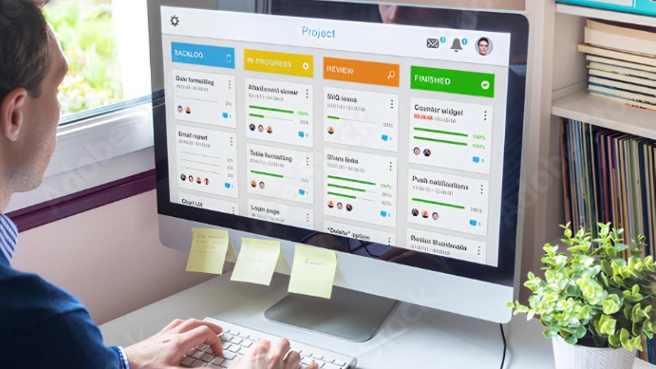
Wireframing and Prototyping
Wireframing and prototyping are critical stages in the UX/UI design process. They serve as the blueprint and interactive model of the final product
.
Importance of Wireframing
Wireframes are skeletal representations of the user interface. They focus on:
- Structure: Showing the basic layout of pages.
- Content Placement: Determining where each piece of content will be.
- Functionality: Highlighting key functions and interactions.
Wireframes allow designers to:
- Visualize the overall structure before adding visual elements.
- Communicate design ideas effectively to stakeholders and team members.
- Identify potential issues early in the design process.
Types of Wireframes
- Low-Fidelity Wireframes: Simple and usually black-and-white sketches.
- High-Fidelity Wireframes: Detailed and more refined versions, often digital.
Tools for Wireframing
Popular wireframing tools include:
- Sketch
- Figma
- Adobe XD
- Balsamiq
Prototyping
Prototyping builds upon wireframes by adding interactivity. Prototypes simulate how the final product will work.
Benefits of Prototyping
- User Testing: Allows for gathering user feedback on functionality and usability.
- Stakeholder Review: Facilitates better understanding and approval from stakeholders.
- Iterative Design: Enables multiple iterations and fine-tuning of design elements.
Prototyping Tools
Effective prototyping tools include:
- InVision
- Axure RP
- Marvel
Best Practices
To streamline the wireframing and prototyping process:
- Start with low-fidelity wireframes to focus on layout and flow.
- Gradually move to high-fidelity wireframes for detailed design.
- Use prototyping tools to create interactive mockups.
- Conduct user testing to validate design assumptions and gather feedback.
- Iterate often based on feedback and testing results.
Designing for Accessibility
Creating accessible designs ensures that everyone, regardless of ability, can interact with a product. Accessibility fosters inclusivity, broadening the reach of digital interfaces. Below are fundamental principles for designing accessible user experiences.
Text and Contrast
Ensuring sufficient contrast between text and background improves readability for users with visual impairments. The Web Content Accessibility Guidelines (WCAG) recommend a minimum contrast ratio of 4.5:1 for normal text.
- Color Contrast: Use color-contrast tools to check and adjust color schemes.
- Font Size: Opt for legible font sizes, typically 16px or larger for body text.
- Text Spacing: Adequate spacing between lines and paragraphs aids readability.
Navigation and Layout
Clear and intuitive navigation helps users with cognitive impairments and those who use screen readers. Consistent and straightforward layouts improve user orientation and reduce cognitive load.
- Consistent Structure: Maintain consistent layouts across various pages.
- Keyboard Navigation: Ensure that all interactive elements are accessible via keyboard.
- Descriptive Links: Use meaningful descriptions in hyperlinks instead of generic “click here” texts.
Visual and Auditory Elements
Consider users who rely on alternative modes of interaction. Providing text alternatives for visual and auditory content is crucial.
- Alt Text: Include descriptive alt text for all images.
- Video Captions: Provide captions and transcripts for video content.
- Audio Descriptions: Add audio descriptions to support users with visual impairments during video playback.
Forms and Inputs
Accessible forms are critical for users with various impairments. Simplified form structures ensure greater usability.
- Labeling: Use explicit labels for form fields and interactive elements.
- Error Messages: Offer clear and helpful error messages with guidance on how to fix issues.
- Field Instructions: Place instructions and examples near form fields to aid comprehension.
Testing and Feedback
Regular testing with assistive technologies and incorporating user feedback ensures continuous improvements.
- Screen Readers: Test design elements with screen readers like JAWS or NVDA.
- User Testing: Engage users with disabilities to provide insights and feedback.
- Accessibility Audits: Conduct periodic audits to identify and resolve potential issues.
Designing for accessibility goes beyond compliance; it is a commitment to creating inclusive, user-friendly experiences for all. Prioritizing these principles leads to more meaningful and effective user interactions.
Focus on Simple and Intuitive Navigation
Navigation is one of the cornerstone elements of UX/UI design. Users should be able to find what they need with minimal effort. When designing navigation systems, a few key principles can guide the process:
- Clarity: Navigation labels should be clear and concise. Avoid jargon or technical terms that might confuse users.
- Consistency: Maintain a consistent style and positioning for navigation elements across all pages. This consistency helps users build familiarity and reduces cognitive load.
- Hierarchy: Establish a clear hierarchy in the navigation structure. Important sections should be prominently displayed, while secondary options can be nested.
- Affordances: Utilize design elements that give users hints about what actions are possible. For example, buttons should look clickable, and links should be underlined or colored.
- Feedback: Provide immediate feedback when users interact with navigation elements. Highlight active states or provide confirmation messages to reinforce their actions.
Implementing Simple Navigation
Consider the use of well-structured menus and sub-menus. The primary navigation should be easily accessible, typically at the top of the page or on a prominent sidebar.
Examples
- Top Navigation: Placing the main navigation links at the top of the page is ideal for content-heavy websites. This arrangement ensures that users can easily scan through available options.
- Sidebar Navigation: For applications with numerous functions, a sidebar can keep everything organized. This method allows for a more detailed hierarchy without overwhelming the user.
Enhancing User Experience
- Breadcrumbs: Use breadcrumb navigation to help users understand their location within the website. This feature is especially useful for websites with multiple layers of content.
- Search Function: Incorporate a search bar to allow users to quickly find what they’re looking for. Ensure the search feature is efficient and provides relevant results.
- Responsive Design: Design navigation that adapts well to various screen sizes. On mobile devices, consider a collapsible menu to save space and improve usability.
In summary, focusing on simple and intuitive navigation facilitates a seamless user experience. By adhering to these foundational elements, designers can create interfaces that are both functional and enjoyable to use.
Consistency and Visual Hierarchy
Consistency enhances a user’s experience by making interfaces intuitive and predictable. Keeping consistent elements across the website or application helps users familiarize themselves quickly.
Key Areas to Maintain Consistency:
- Typography: Use a limited set of fonts and sizes for headers, sub-headers, and body text.
- Color Scheme: Stick to a specific color palette that aligns with the brand’s identity.
- Icons and Imagery: Ensure icons have uniform style and graphics follow a consistent editing pattern.
- Spacing and Layout: Uniform margins, padding, and alignment across pages.
Consistency doesn’t negate creativity. It strengthens the design by providing a reliable framework within which creative elements can shine.
Visual Hierarchy
Visual hierarchy guides users’ focus to important elements first, providing a seamless navigation experience. It leverages size, color, contrast, and spacing to indicate the importance of elements.
Techniques to Create Effective Visual Hierarchy:
- Use of Size and Scale: Larger elements naturally draw more attention. Prioritize significant content by enlarging it.
- Color Contrast: Use contrasting colors for calls to action and critical information.
- Typography Weight and Style: Employ bold and varied font weights to distinguish headings and key information from regular text.
- Whitespace Utilization: Surrounding crucial elements with whitespace highlights them, ensuring these elements do not get lost in a crowded layout.
Effective visual hierarchy ensures users can effortlessly ascertain the layout’s structure and the relative importance of the elements. Elements that adhere to defined visual hierarchy capture users’ attention and direct them towards desired actions efficiently.
Effective Use of Color and Typography
An essential aspect of UX/UI design involves the strategic use of color and typography. These elements significantly impact the user experience by enhancing readability, guiding user behavior, and evoking emotional responses. Here are key considerations:
Colour
- Colour Psychology: Colors evoke specific emotions and reactions. For example:
- Red: Urgency, excitement, attention.
- Blue: Trust, calmness, professionalism.
- Green: Growth, tranquility, health.
- Brand Consistency: Align colors with brand identity to create a cohesive look and feel. It reinforces the brand in users’ minds.
- Accessibility: Use high-contrast color combinations to ensure readability for all users, including those with visual impairments. Tools like the Web Content Accessibility Guidelines (WCAG) help inform these choices.
- Colour Palette: Limit the palette to a few core colors to maintain harmony and avoid overwhelming the user. Typically, primary, secondary, and neutral colors suffice.
Typography
- Font Selection: Choose fonts that enhance readability and align with the brand’s voice. Sans-serif fonts are often preferred for digital interfaces due to their clean and modern appearance.
- Hierarchy and Structure: Use typographic hierarchy to guide users through content. Establish clear differences between headings, subheadings, and body text. This structure aids in content scanning.
- Readability: Maintain optimal readability by considering:
- Font Size: Use sizes that are legible across devices, typically 16px for body text.
- Line Height: Ensure adequate spacing between lines (1.5 times the font size) to avoid clutter.
- Line Length: Ideal line length ranges from 50-75 characters per line to prevent reading fatigue.
- Consistency: Apply consistent typography styles throughout the design. This includes font sizes, line heights, and spacing. Consistency reassures users and enhances familiarity.
By applying these principles, designers can create visually appealing and functional interfaces that enhance user engagement and satisfaction. Effective use of color and typography is pivotal in crafting user-friendly and aesthetically pleasing designs.
User Feedback and Iterative Design
Collecting user feedback is a cornerstone of effective UX/UI design. It allows designers to understand users’ needs, preferences, and pain points. By incorporating this feedback, designers can iterate on their designs to improve usability and satisfaction.
Importance of User Feedback
- Identifies Pain Points: User feedback highlights areas where the interface is not intuitive, helping to identify pain points that need addressing.
- Informs Improvements: Feedback provides concrete insights into what works well and what doesn’t, guiding necessary improvements.
- Enhances Usability: Receptive to user feedback can make the product more user-friendly, ensuring a smoother experience.
- Boosts Engagement: Engaged users often feel valued when their opinions shape the product, fostering loyalty.
Methods for Collecting User Feedback
There are several methods to gather user feedback, including:
- Surveys: Short, targeted surveys can capture specific user insights. Tools like SurveyMonkey or Google Forms are useful.
- Usability Testing: Direct observation of users interacting with the design can reveal usability issues. Tools like UserTesting can facilitate this.
- Interviews: Conducting one-on-one interviews provides in-depth understanding of user experiences and expectations.
- Analytics: Analyzing user behavior through tools like Google Analytics offers quantitative data to supplement qualitative feedback.
- Feedback Forms: Integrated feedback forms within the interface itself can capture spontaneous user opinions.
Iterative Design Process
The iterative design process hinges on continual improvement based on feedback. It typically involves:
- Prototype Development: Creating initial designs or wireframes based on user requirements.
- User Testing: Testing these prototypes with real users to gather feedback.
- Analysis: Reviewing feedback to identify trends and areas for enhancement.
- Iteration: Refining the design based on analysis, leading to further prototyping and testing.
Best Practices
- Continuous Feedback Loop: Maintain an ongoing loop of feedback and iteration. Regularly scheduled feedback sessions ensure the design evolves with user needs.
- Prioritize Issues: Not all feedback will be equally critical. Prioritizing issues based on impact helps manage resources effectively.
- Document Changes: Keeping a detailed log of changes and the reasons behind them helps track progress and rationalize decisions to stakeholders.
- Involve Diverse Users: Gathering feedback from a diverse user base ensures the design caters to a broad audience, enhancing inclusivity.
Effective UX/UI design is an ongoing process. Engaging users for feedback and iterating based on their input can significantly enhance the overall quality and user satisfaction of the final product.
Learning from Real-World Examples
One of the most effective ways to understand and master UX/UI design is through analyzing real-world examples. Reviewing successful designs provides insights into what works well and why. It also offers a practical context, which is invaluable for beginners.
Case Studies
- Airbnb: The usability and simplicity of Airbnb’s interface exemplify effective UX design. The intuitive search function, clear visual hierarchy, and engaging imagery contribute to a seamless user experience.
- Spotify: Spotify’s clean design and user-centric approach cater to both new and existing users. The platform’s personalized recommendations and minimalistic design are key elements worth studying.
- Apple: Apple’s design is renowned for its simplicity and elegance. The company’s consistent use of typography, spacing, and visual hierarchy sets a high benchmark for intuitive design.
Common Patterns
Identifying common design patterns across successful applications can help beginners recognize and utilize these in their own projects. Common patterns include:
- Navigation: Well-designed navigation ensures users can move through an application intuitively. Hamburger menus, tab bars, and breadcrumb trails are frequently employed.
- Forms: Well-crafted forms enhance usability by minimizing the effort required from users. Using clear labels, inline error messages, and logical grouping are effective techniques.
- Feedback: Providing users with timely feedback helps them understand the outcome of their actions. Loading indicators, success messages, and error alerts are common feedback mechanisms.
User Testing Insights
Real-world examples often highlight the importance of user testing. By observing how actual users interact with a design, valuable insights can be gathered. This helps in refining the UX/UI to meet real-life needs effectively.
- A/B Testing: Comparing two versions of a design to see which performs better.
- Usability Testing: Observing users as they complete tasks to identify usability issues.
- Heatmaps: Visual representations of where users are clicking, helping to understand interaction patterns.
Design Guidelines
Following established guidelines from industry leaders ensures a solid foundation in UX/UI design:
- Material Design: Google’s design system offers principles and best practices for building visually appealing, functional interfaces.
- Human Interface Guidelines: Apple’s guidelines provide comprehensive advice for designing iOS apps, focusing on clarity, deference, and depth.
By learning from and analyzing these real-world examples, beginners can better understand effective design principles and techniques, speeding up their development as proficient UX/UI designers.
Conclusion: Putting It All Together
Effective UX/UI design can elevate digital products from functional to exceptional. Mastering the basics of design principles, understanding user behavior, and continual testing are fundamental to success. By integrating the key concepts discussed, beginners can create more intuitive and user-friendly designs that cater to their audience’s needs. Below, a consolidated recap of the essential tips and practices to enhance UX/UI design:
- Emphasize an Intuitive Layout:
- Prioritize simplicity and clarity in design.
- Ensure that navigation is straightforward.
- Place critical elements prominently for easy access.
- Consistency is Key:
- Use consistent colors, typography, and visual styles.
- Inform users about interactive elements by maintaining uniformity.
- Leverage design systems or style guides to maintain consistency across projects.
- Prioritize User Feedback:
- Conduct user testing regularly.
- Incorporate feedback loops through surveys and usability tests.
- Adapt designs based on real user interactions to enhance satisfaction.
- Focus on Accessibility:
- Ensure compliance with accessibility standards (e.g., WCAG).
- Offer alternative text for images and video prompts.
- Design for a wide range of users, including those with disabilities.
- Leverage White Space:
- Use white space to improve readability.
- Avoid cluttering the design; let elements breathe.
- White space can guide users through the content flow naturally.
Final Takeaways:
- Understand User Needs: Conduct thorough research to identify user expectations and pain points.
- Iterate Often: User experience feedback should continuously refine designs.
- Stay Updated: The field of UX/UI rapidly evolves. Stay abreast of trends and technological advancements.
- Cross-disciplinary Collaboration: Work closely with developers, marketers, and other stakeholders to ensure a cohesive product.
- Measure Success: Use analytics to track user interaction and engagement to inform future design decisions.
This synthesis of tips and best practices aims to build a strong foundation for designers starting their journey in UX/UI. Successful implementation will lead to more engaging, user-centered digital experiences.


